A Design Review of Tesla's Brutalistic Cybertruck
Why is Elon's truck a triangular wedge and what does it say about Tesla's (and Elon's) vision of the world?
First of all, I can't help but to notice it looks like a slice of cheese if it were yellow and had holes in it 🤭
The thing that really gets me though is how sore it would stick out in the real world. What other thing looks like this? In what environment would the Cybertruck look most "at home"?
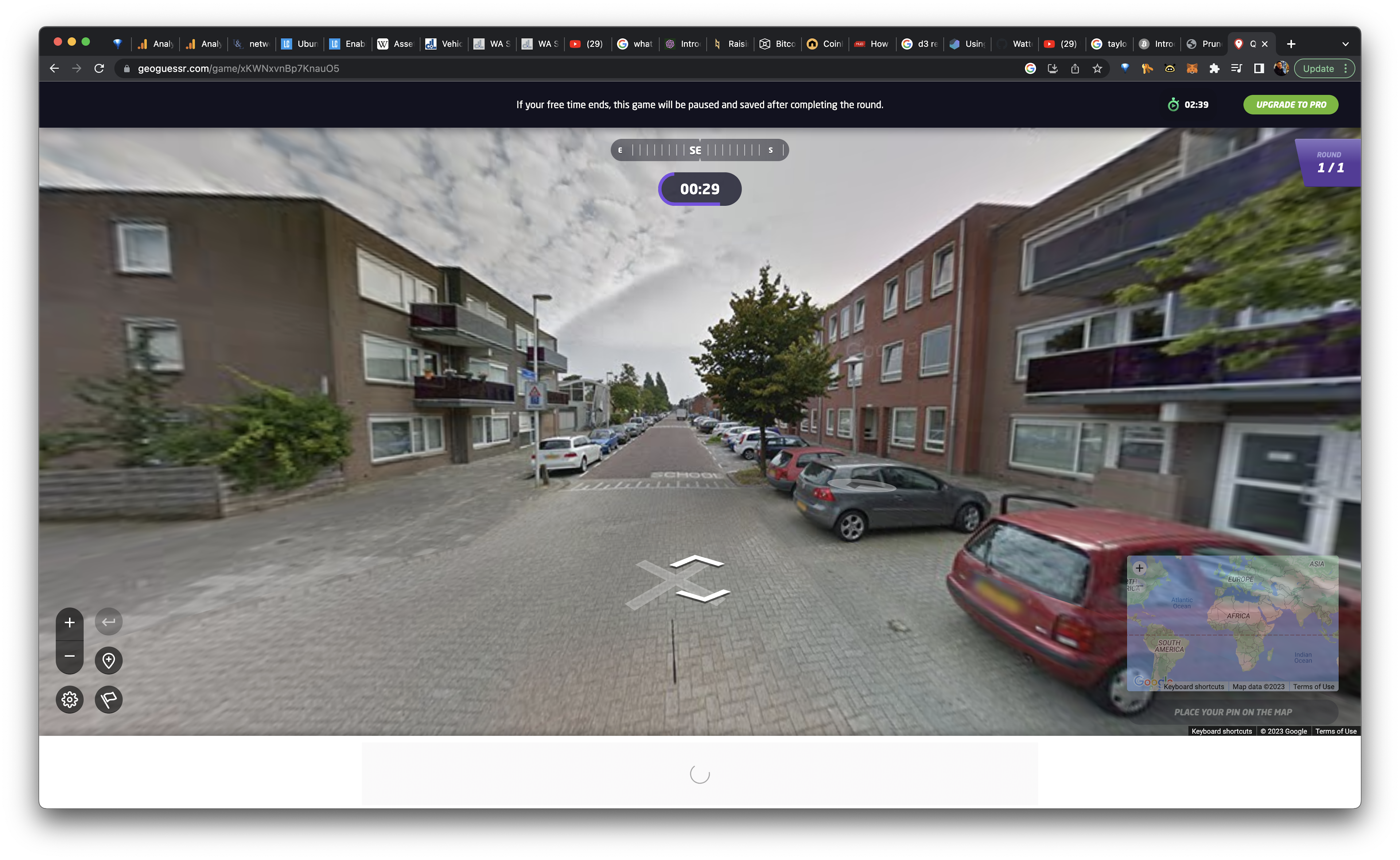
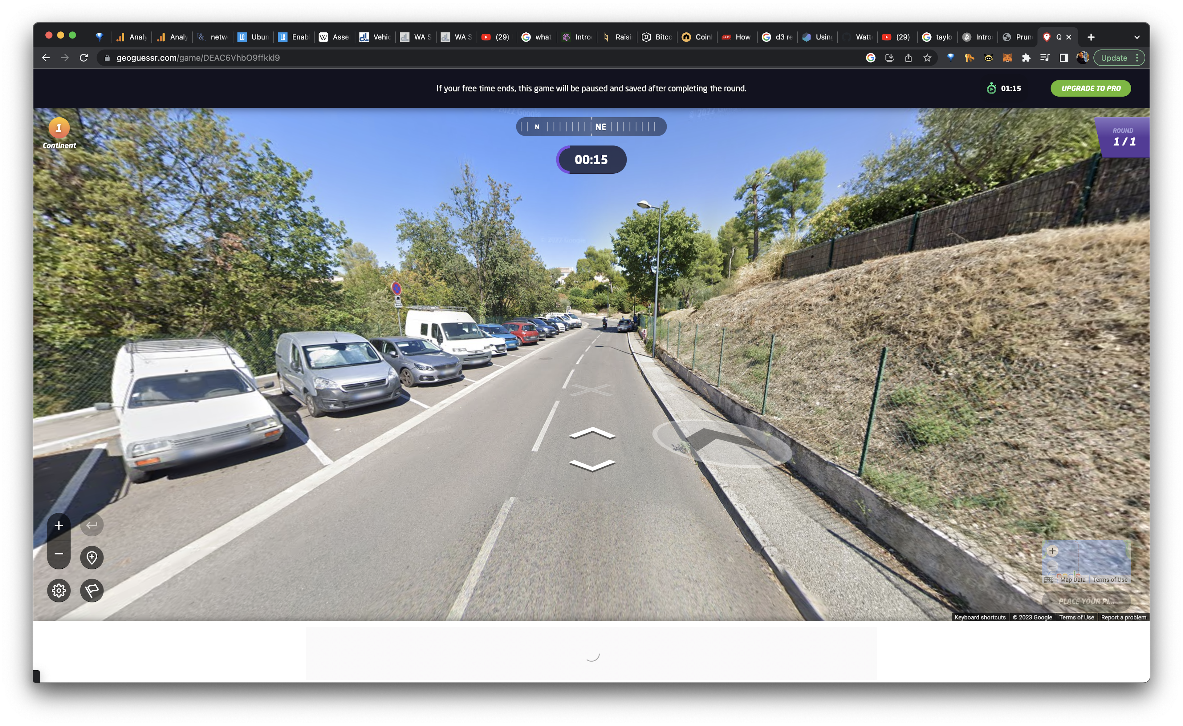
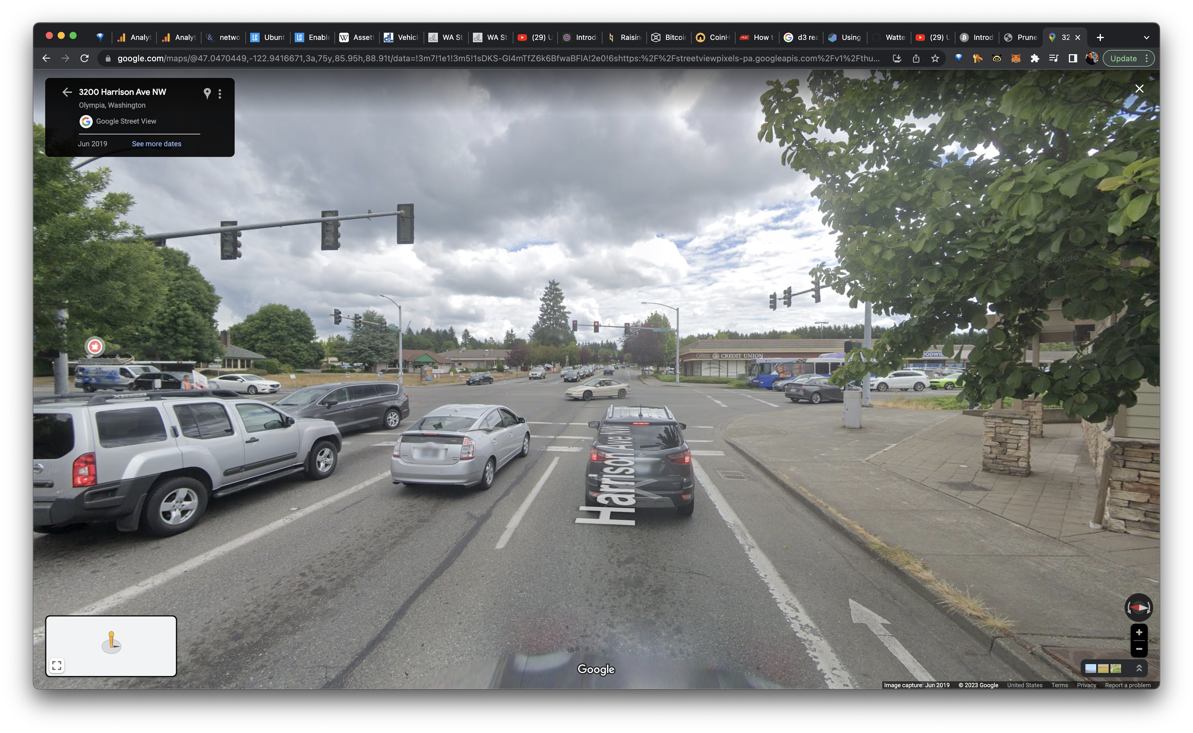
Certainly not in the real world. For those who don't get out that much, here are some pictures of the real world:


This is where Elon expects folks to be driving the Cybertruck. Are you serious? 🤌🤌🤌
We're not talking about a supercar. This isn't a Ferrari that's supposed to stick out. This is a truck. It's supposed to appear normal and convey a sense of utility. Unless you're telling me Elon's major contribution to automotive design is: trucks are supposed be attention magnets. No dude, none of Tesla's other designs stick out. The Model S, 3, and X are beautiful, flowing, and crucially within the context of normality. The Cybertruck is none of these. It grabs attention for it's own sake and sticks out like a sore thumb wherever it goes.
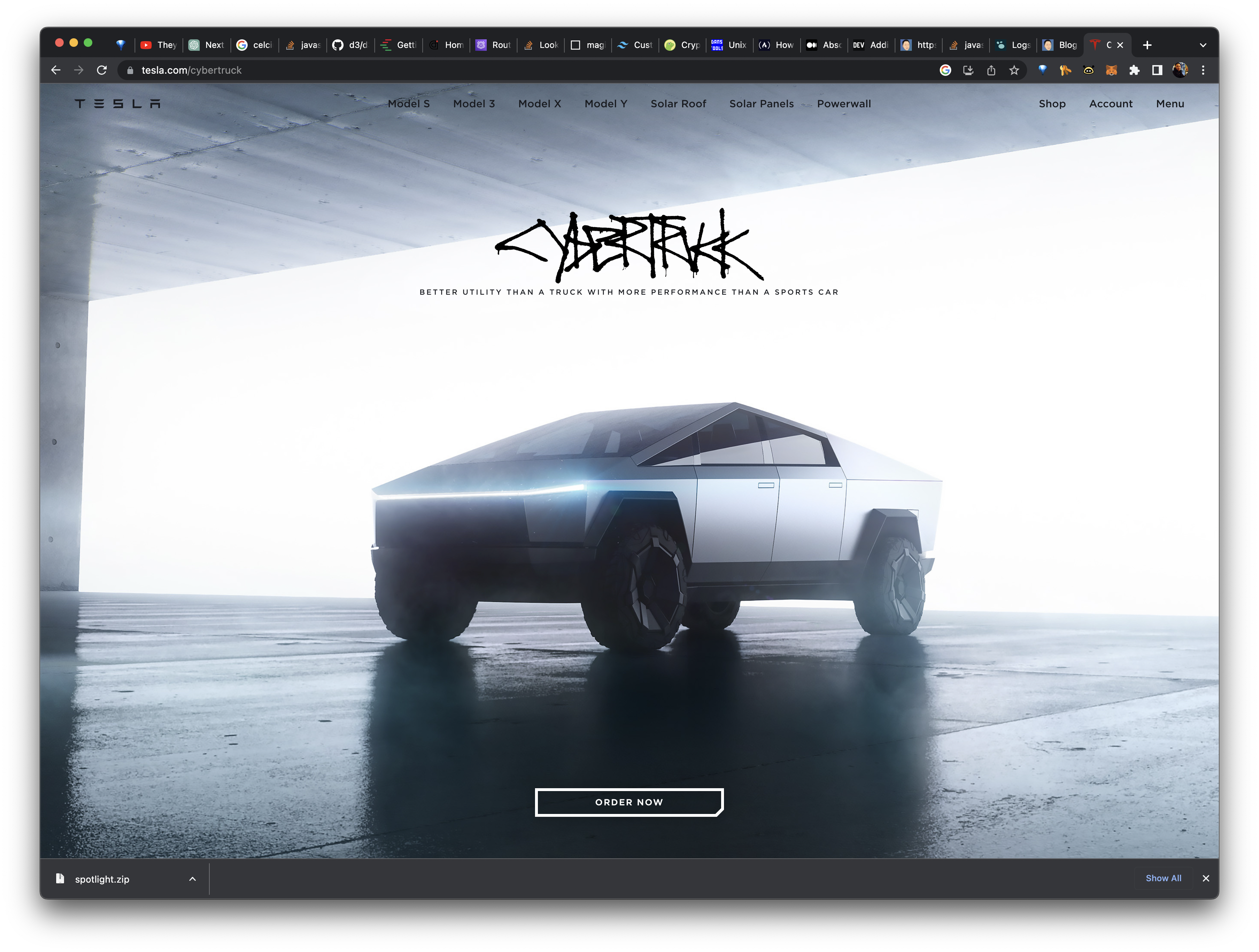
Ok ok, there is one context where the Cybertruck looks cool: online.

Look how cool it looks on my laptop! It's the coolest tab I have open right now 😂. I hear Elon bros yelling at me: "That's why they called it _Cyber_truck!" Ok but ask yourselves: do we want a truck that works out IRL or do we want a truck for the metaverse?
Elon is terminally online and he's fishing for internet points. His Cybertruck design is reflective of that. Let's just say if he designed his rockets with the same criteria, SpaceX wouldn't work out. Trucks have a job to do and the Cybertruck didn't dress the part. It's a boy-toy designed by someone who seeks attention above communicating utility--sadly reflective of our social media era. A Metaverse Truck for the OnlyFans (TM) age. And honestly? I'm not sure we deserve better.